
Are you able to identify any trends in your dental practice?
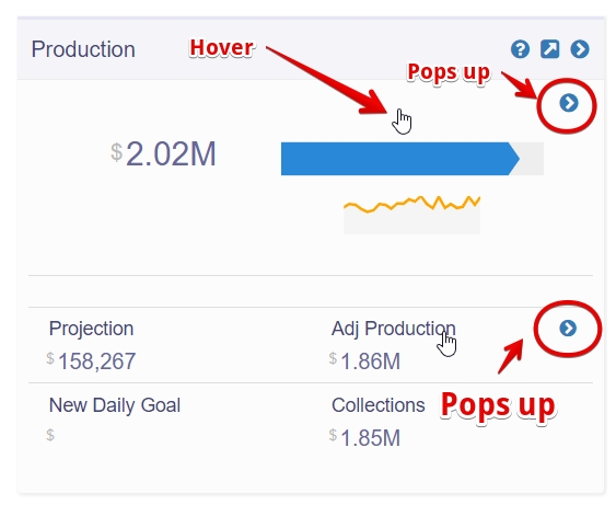
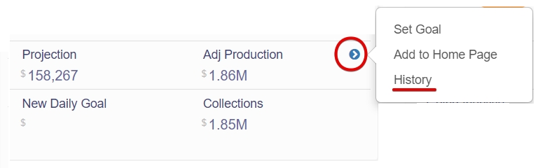
Practice by Numbers provides you with historical numbers for almost all KPIs in the form of bar graphs with data going back two and a half years. Access this history graph by hovering your cursor over an individual KPI, which leads to a small blue arrow icon popping on the upper right corner of that KPI - click on the icon to see the 'History' option.
These historical bar graphs are a valuable tool for monitoring the performance of your KPIs over time. Notice the graphs carefully to discover patterns and trends. Correlate the trends with the actual operations of the practice and take necessary action if required.
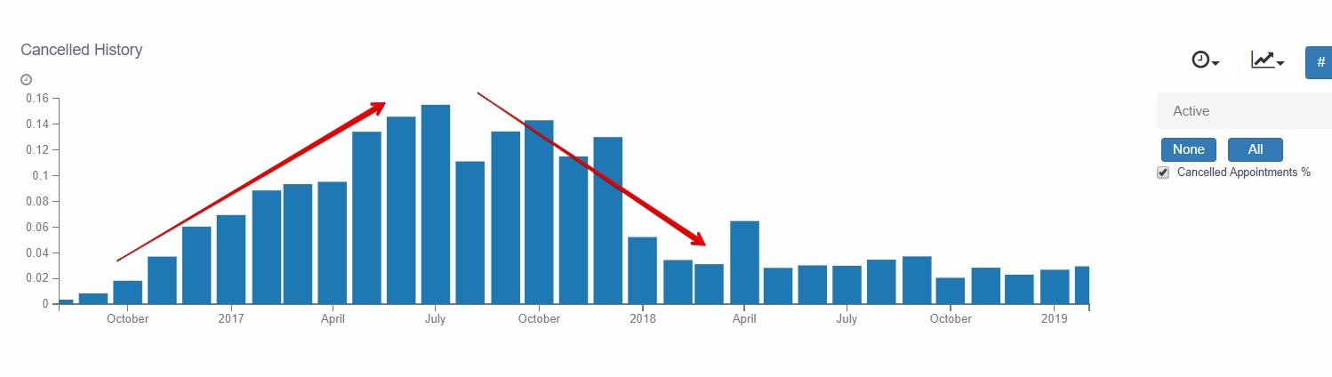
For example: The screenshot below shows the historical graph of number of cancelled appointments per month from Aug 2016 to Feb 2019. Notice how the graph continuously rises for almost an year and then falls and eventually stabilizes. Questions that come to mind are: What was the underlying cause for an increase in cancelled appointments? What steps were taken to improve the cancellation rate? Was there any training give on how to manage cancellations? Did the office change its policy on handling cancellations? Answering such questions will help in analysis of Cancellation rate in the office.
3 features in History graphs:
-
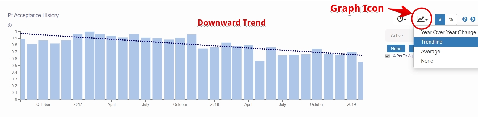
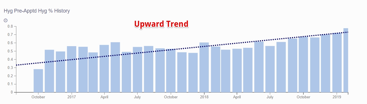
Trendline: Click on the small graph icon on the top right and select Trendline to overlay a line trending over the bar graph. With the help of a trendline you can determine a downward or an upward trend.
-
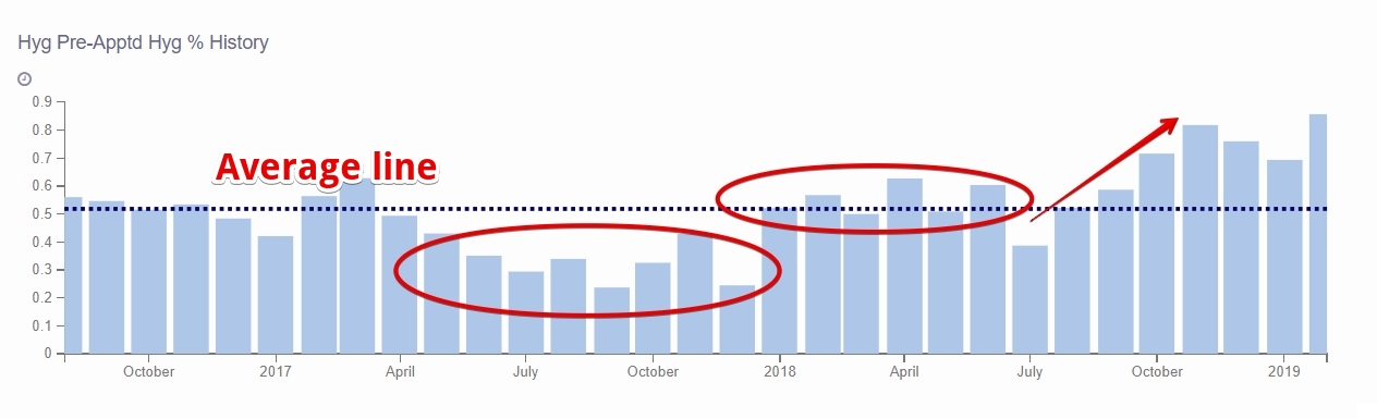
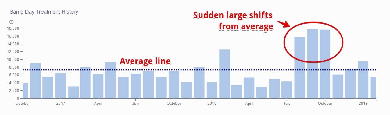
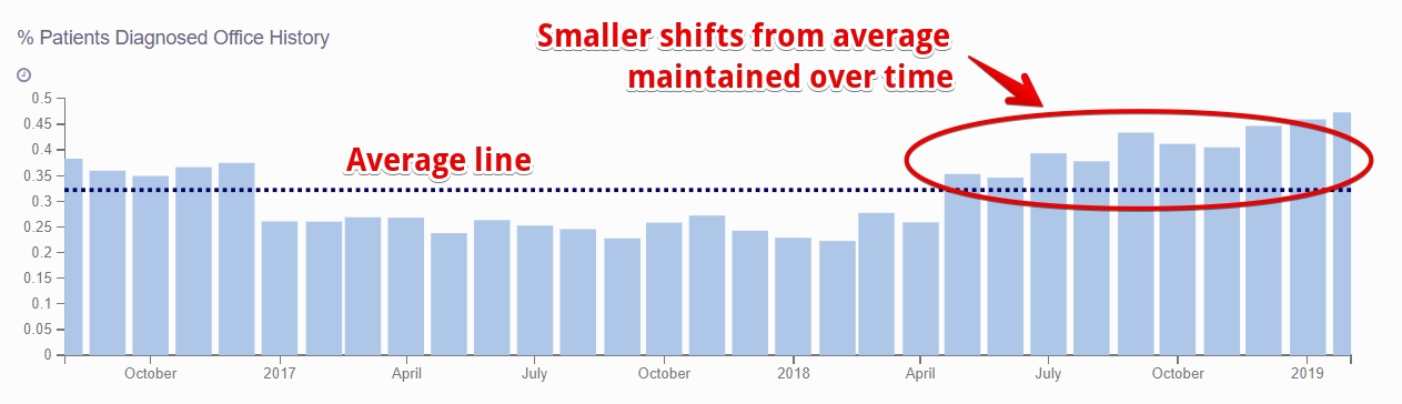
Average: There is also an option to display an Average line over the bar graph. Look at data points above or below average. Notice patterns like 'sudden large shifts from average' or 'smaller shifts from average maintained over time' and analyze why they happened.
-
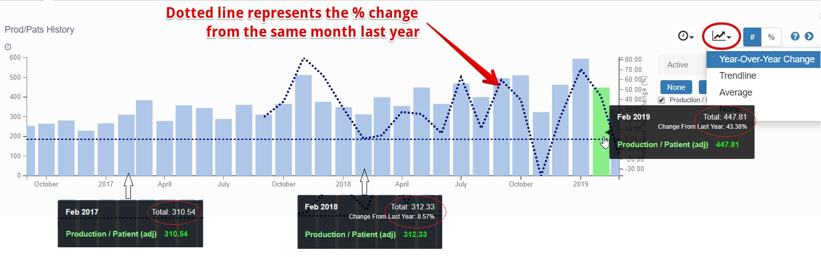
Year-Over-Year Change: Selecting this option displays a dotted line which represents the %age change in data for the same month last year.
Trendline examples:
Average examples:
Year-Over-Year Change example:
You may also like the article on - Bar graphs in PracticeIQ