- Help Center
- Practice IQ
- How to read graphs?
-
Getting Started
-
Users and Login Information
-
Templates and Messages
-
Schedule and Online Appointment Booking
-
Patient Information
-
Online Forms
-
Reputation
-
Practice IQ
-
Revenue IQ
-
Tasks
-
Phone IQ
-
Marketing IQ
-
Patient Flow
-
Payments
-
PBN Settings
-
Enterprise Pages
-
Eaglesoft Best Practices
-
Open Dental Best Practices
-
Dentrix Best Practices
-
Product Releases
-
Known and Resolved Issues
-
Additional fees and overages
-
PBN Apps
-
Insurance Verification
-
FAQ's
-
Patient Portal
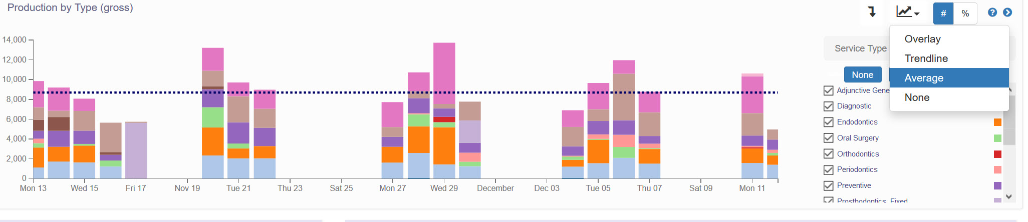
Bar Graphs in Practice IQ
Selecting additional graph overlays.
In the panels with bar graphs, there are options to add additional information to assist in identifying trends in the specific category.
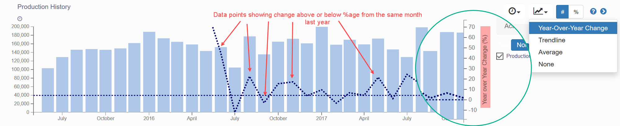
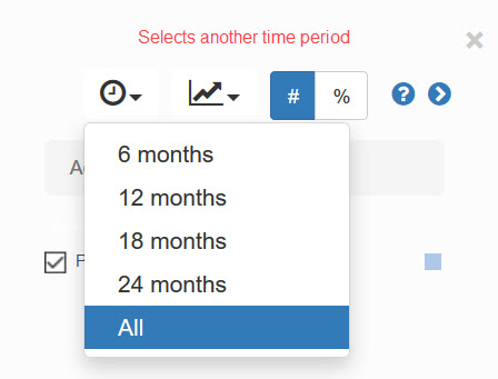
The icons to the upper right of the title bar represent different comparison tools. If there is a clock icon, first from the left has a drop-down menu to change the time period for this graph, so you don't have to go to change the time period for the entire page.
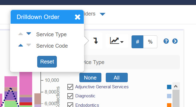
If the panel has drill-down categories, there will be an icon to change the order.
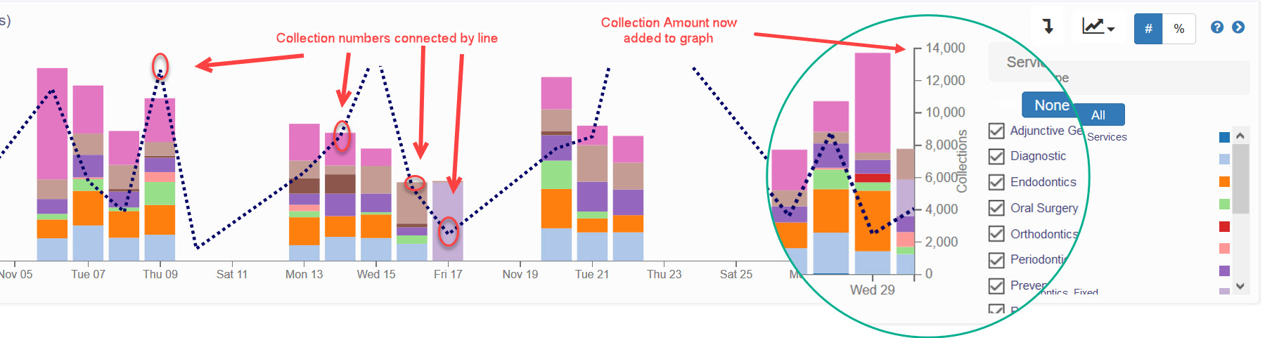
The next icon, resembling a line graph, has a menu to place some additional line graphs to help analyze a trend and compare the KPI vs the previous year or a totally different KPI. For example, a line graph showing Collections can overlay the Gross Production bar graph at the top of the Provider Productivity - Summary page. Click here for a larger view of the screenshot below.
The Trend option places a single line to illustrate directional changes in the daily or monthly totals. The Average selection will place one horizontal line of the average capacity for the time period on the graph.
The Year over Year selection will overlay a line graph that connects the data points of the percentage difference that the month has compared to the previous year. Click here for a larger view of the image below.